Case study · SaaS · Restaurant technology

ApperKot: a SaaS landing page that sells restaurant automation

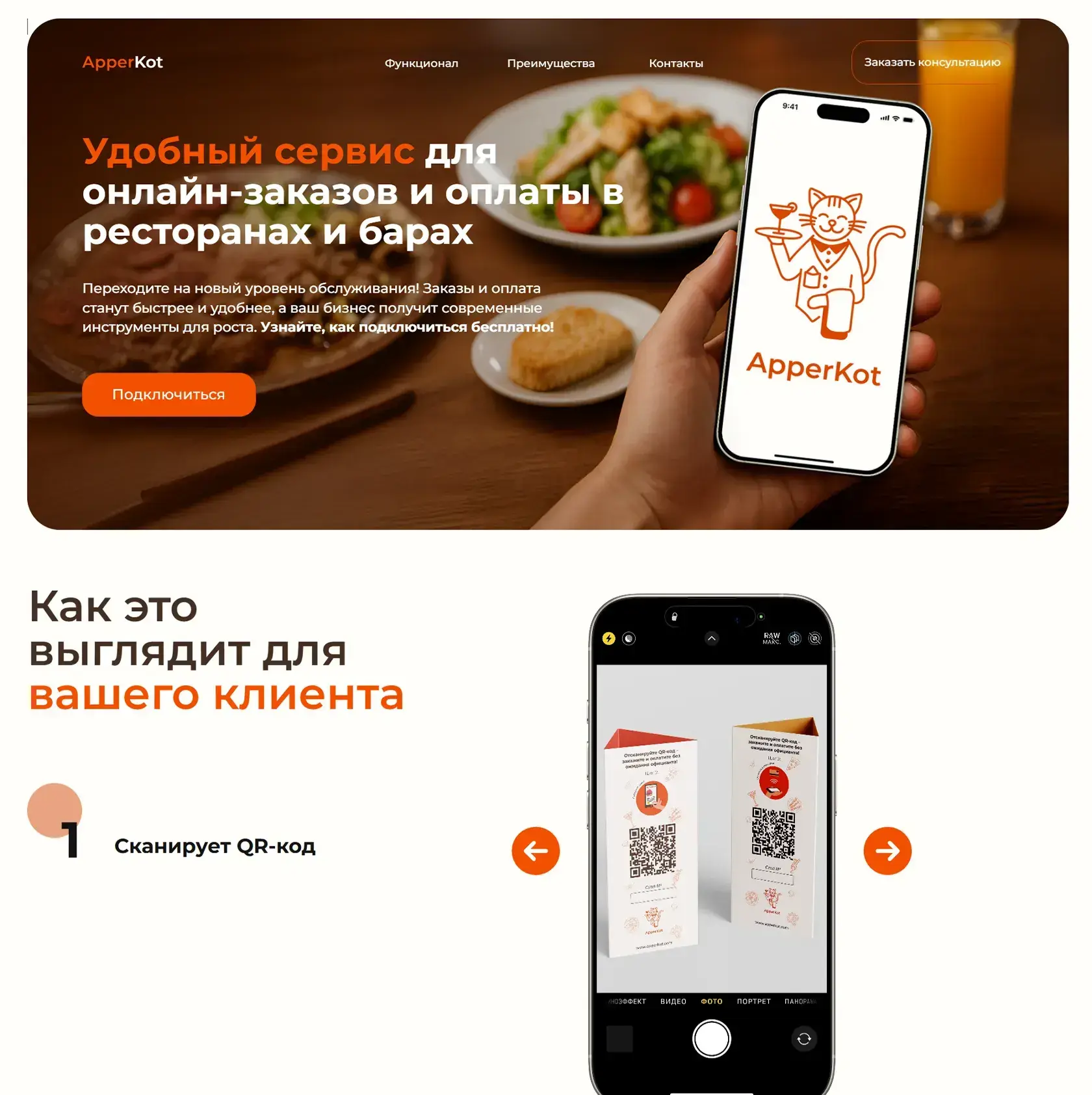
ApperKot lets restaurant and bar guests scan a QR code, order and pay right at the table. We built a landing page that sells this automation to owners from the first screen - mechanics, growth numbers and a direct path to a connection request.

Client
ApperKot
Market
Restaurants & bars
Industry
SaaS, QR ordering and payments
Scope
Positioning, UX/UI design, landing page development
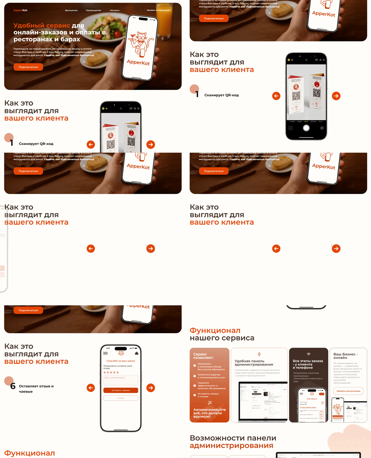
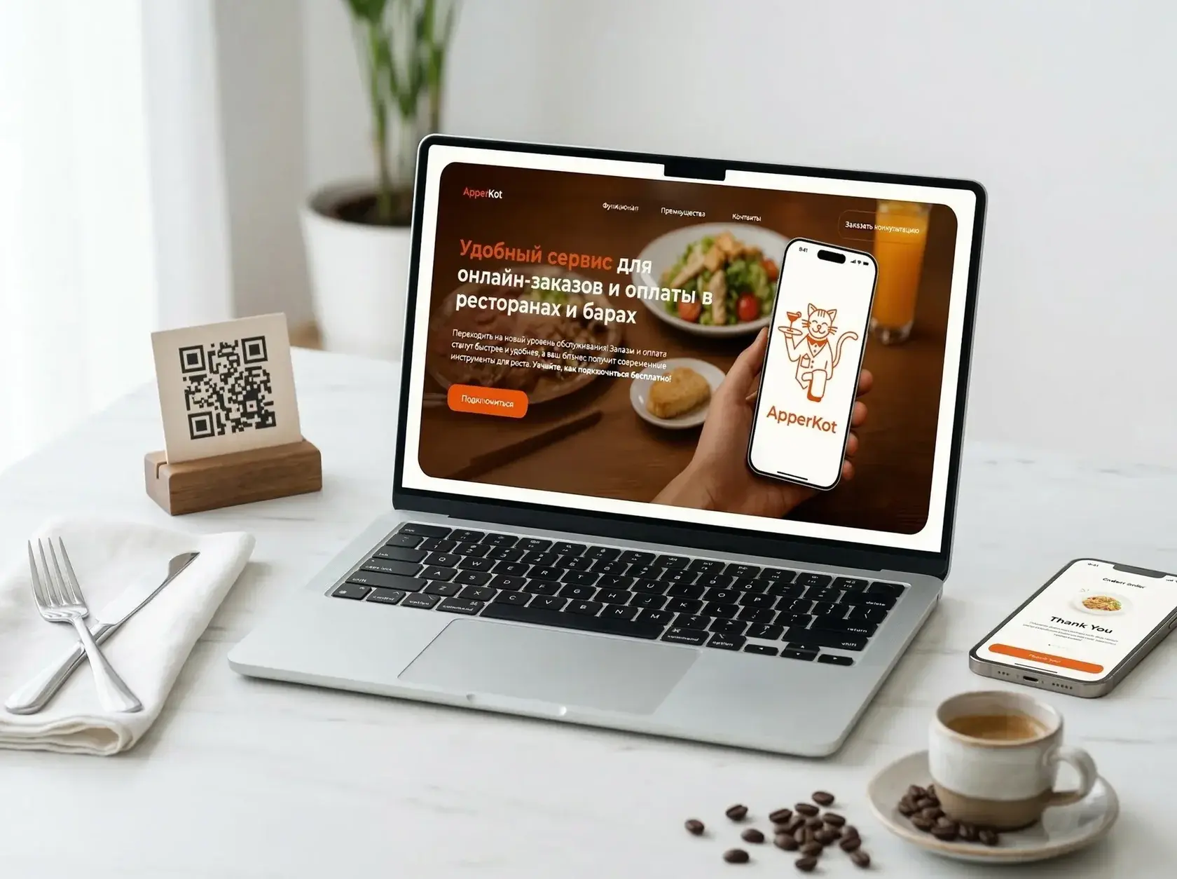
Apperkot.store first screen with QR ordering - SaaS landing page designed by Thrive Solutions
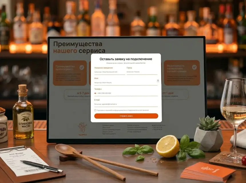
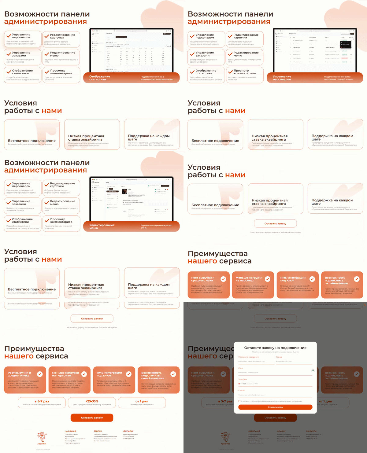
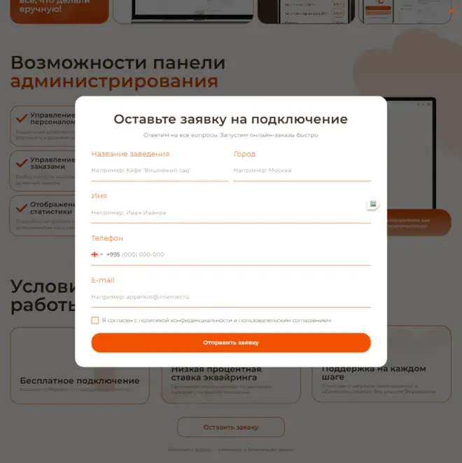
Connection request pop-up on the ApperKot landing page
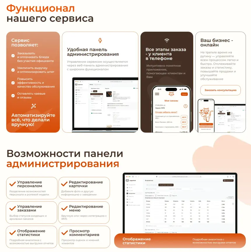
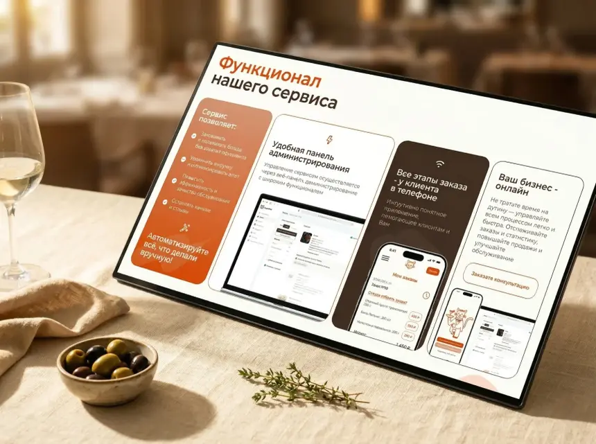
Service features section of the ApperKot landing page
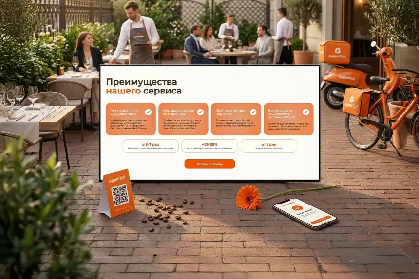
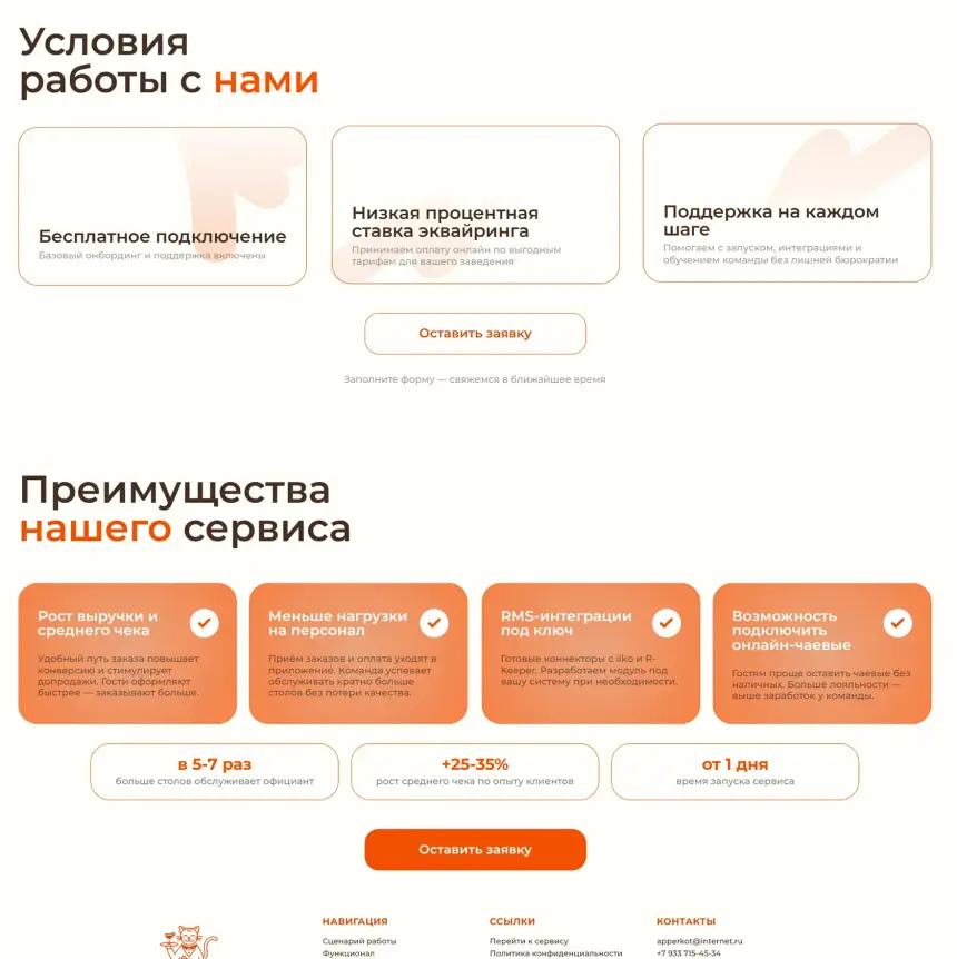
Terms and benefits on the ApperKot landing page
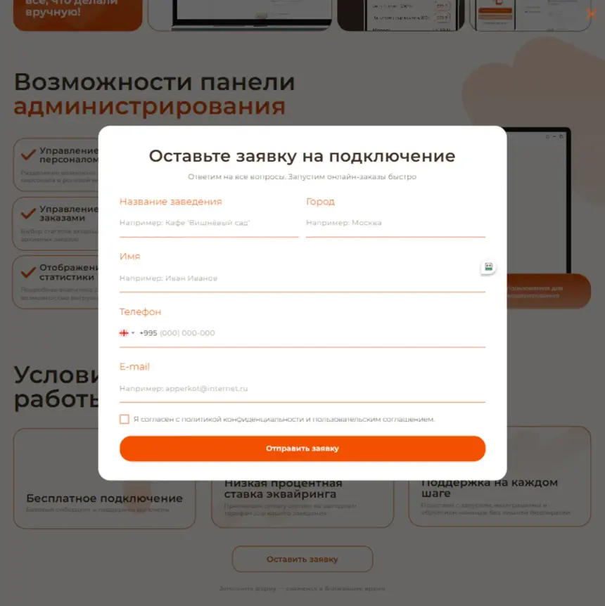
Free connection request form for restaurants
01

Turn a sceptical owner into a client before the first scroll

ApperKot ecosystem: guest app, admin panel and landing page

Restaurants lose revenue whenever a guest waits for a server. ApperKot fixes that - and the landing page had to get this idea across to an owner in the first three seconds.

Average-cheque growth, simple QR ordering mechanics and free connection: every block answers a specific objection and leads to one action - leaving a request.

  • Value in three seconds
  • Numbers instead of slogans
  • Answer every objection
  • One action: request a connection
02

Product mechanics and the owner's decision

We studied how the service works and how restaurant owners decide - from first contact with the product to a connection request - to show the business benefit early and remove key objections.

ApperKot landing page on a laptop in a restaurant
Product specifics

QR ordering, the admin panel, iiko and R-Keeper integrations and in-venue service.

Purpose of the landing

A structure that leads an owner from introduction to connection.

Audience behaviour

From initial scepticism to a confident decision.

Positioning

A modern partner that grows revenue and is easy to understand.

03 · User journey

Structure as a sales tool

Pain, solution, numbers, trust, action - a precise sequence of screens that leads a sceptic to a request.

ApperKot features section on a laptop
Step 1

Meet the product

  • Value from the first screenThe owner sees the service's value and key features without scrolling.
  • Benefits by business taskEach argument is found instantly.
  • Call to action throughoutA connection button on every screen.
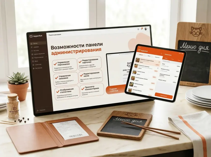
ApperKot admin panel shown on the landing page
Step 2

See how it works

  • Grouped by scenarioOrders, payments, tips, analytics and integrations.
  • Features with numbersEach feature has a description, a real growth figure and a call to action.
  • A fast decisionThe benefit is clear without complex navigation.
ApperKot connection form on a laptop
Step 3

Request a connection

  • Step-by-step persuasionFrom first screen to form without overload.
  • Trust blocksNumbers, venue reviews and terms remove doubts.
  • A short formRegistration is quick, with no unnecessary fields.
04 · Visual system

A design tuned to sell

A warm palette, appetising photos and clear typography work as one persuasion system - an owner understands the value in ten seconds.

  1. 01

    Food at the centre

    Appetising dishes and real restaurant scenes create an emotional connection.

  2. 02

    Colour as a guide

    Orange leads the eye and always points to the connection button.

  3. 03

    Numbers, not promises

    +35% average cheque, 5× more tables per server, launch in 1 day.

  4. 04

    Clean and airy

    Few distractions keep attention on the benefits.

  5. 05

    The form where it's needed

    The connection button appears exactly when an owner is ready.

  6. 06

    The same on every device

    Owners check it on a phone between tables - it works perfectly.

05

An interface built for restaurant owners

One scenario: a sceptical owner understands the product's value in one scroll and leaves a request.

A hero that sells in 3 seconds

The value is readable instantly, and the button is right there.

Numbers in the right place

Key figures appear exactly where doubts begin.

Buttons at the right moment

The form sits at every key point of the page.

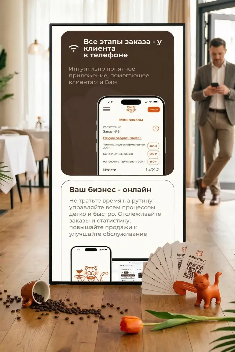
ApperKot guest ordering on a phone
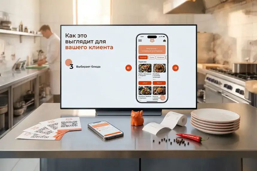
ApperKot digital guest menu
ApperKot benefits section on a laptop
06 · Interaction

A landing page that works like a funnel

Each screen is the next step: an owner moves from 'what is this?' to 'I want to connect' without noticing.

Animated scroll through the ApperKot landing page
Scroll leads to a requestEvery block answers one question and passes to the next.
Animated ApperKot admin panel demo
The form at the right momentThe call to action appears where the owner is ready.
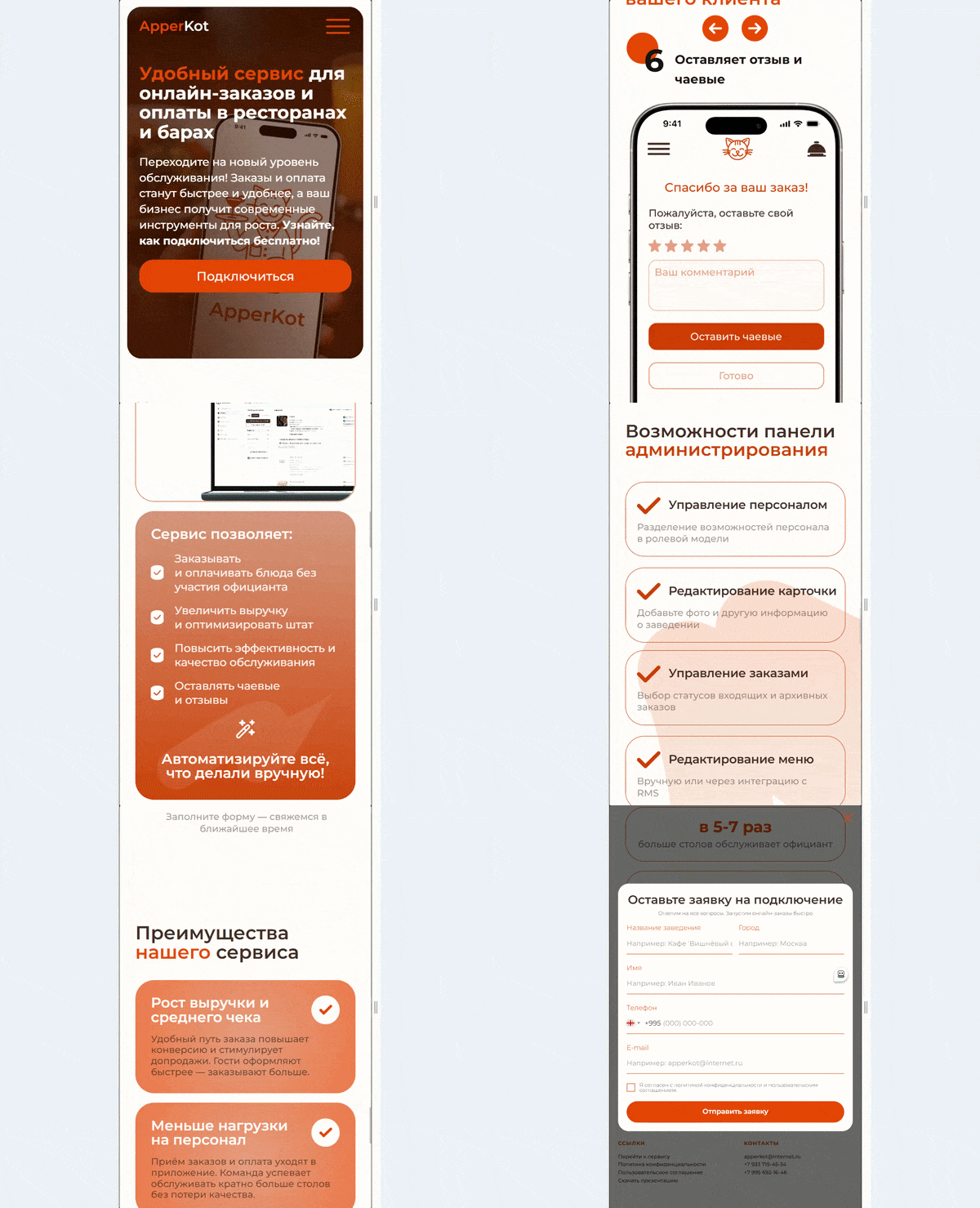
Animated mobile version of the ApperKot landing page
Sells on any screenConverts just as well on every device.
07 · Result

A landing page that turns sceptics into clients

We packaged a complex SaaS product into a simple story: arrive, understand the benefit, leave a request. The page structures the product's value, closes objections and generates a steady flow of connection requests.

For the brand

A professional service image, steady connections and a confident place in the automation market.

For owners

No jargon - clear benefits, convincing numbers and a button at the right moment.

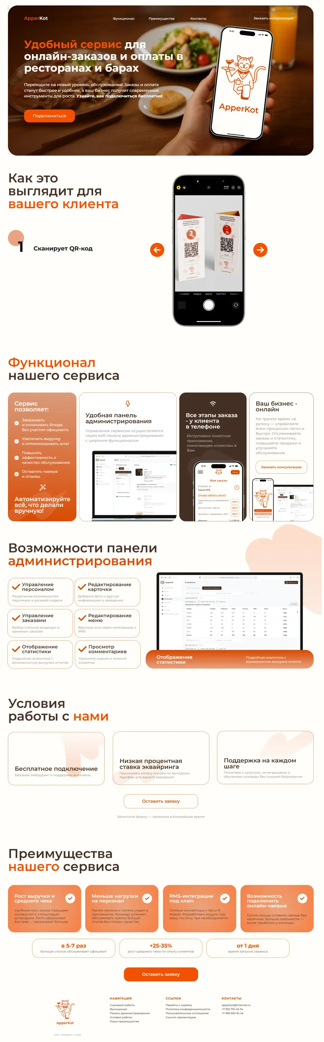
Full ApperKot landing page for a restaurant ordering serviceHover to scroll the page
Let's talk

Ready to be the business Toronto finds first?

Tell us about your project and get a free growth plan within one business day: what to fix, what to build and what it will cost.