Case study · Wellness studio · Toronto

Karina Stretch Me: a studio website that turns curiosity into trial classes

Karina Stretch Me is a women's stretching and gentle movement studio in Toronto, combining in-person classes, online sessions and community. We built a site that leads from the first visit to a booked trial class.

Client
Karina Stretch Me
Location
Toronto, Ontario
Industry
Women's stretching studio
Scope
UX/UI design, website development, booking flow
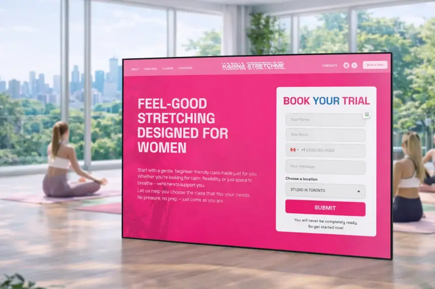
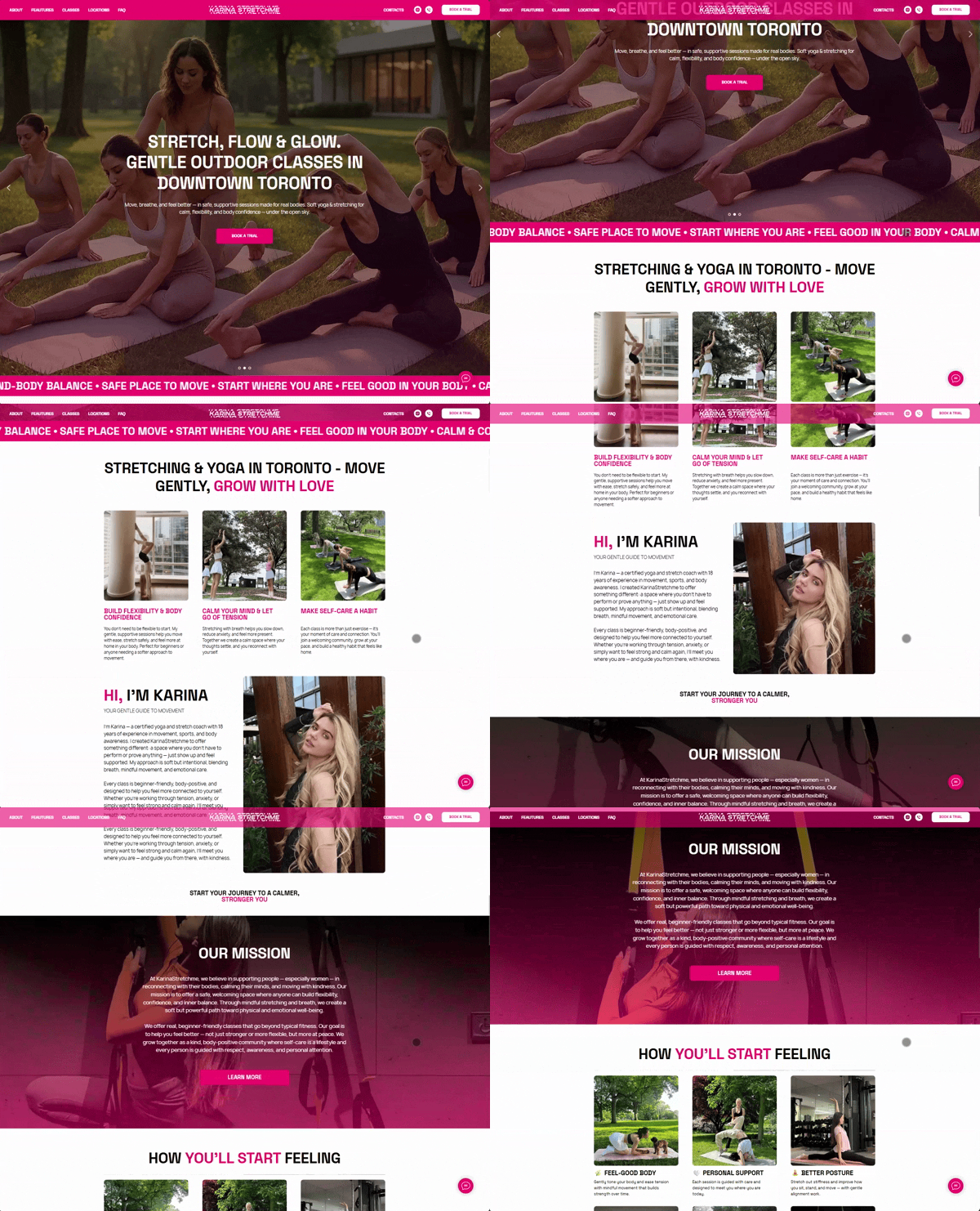
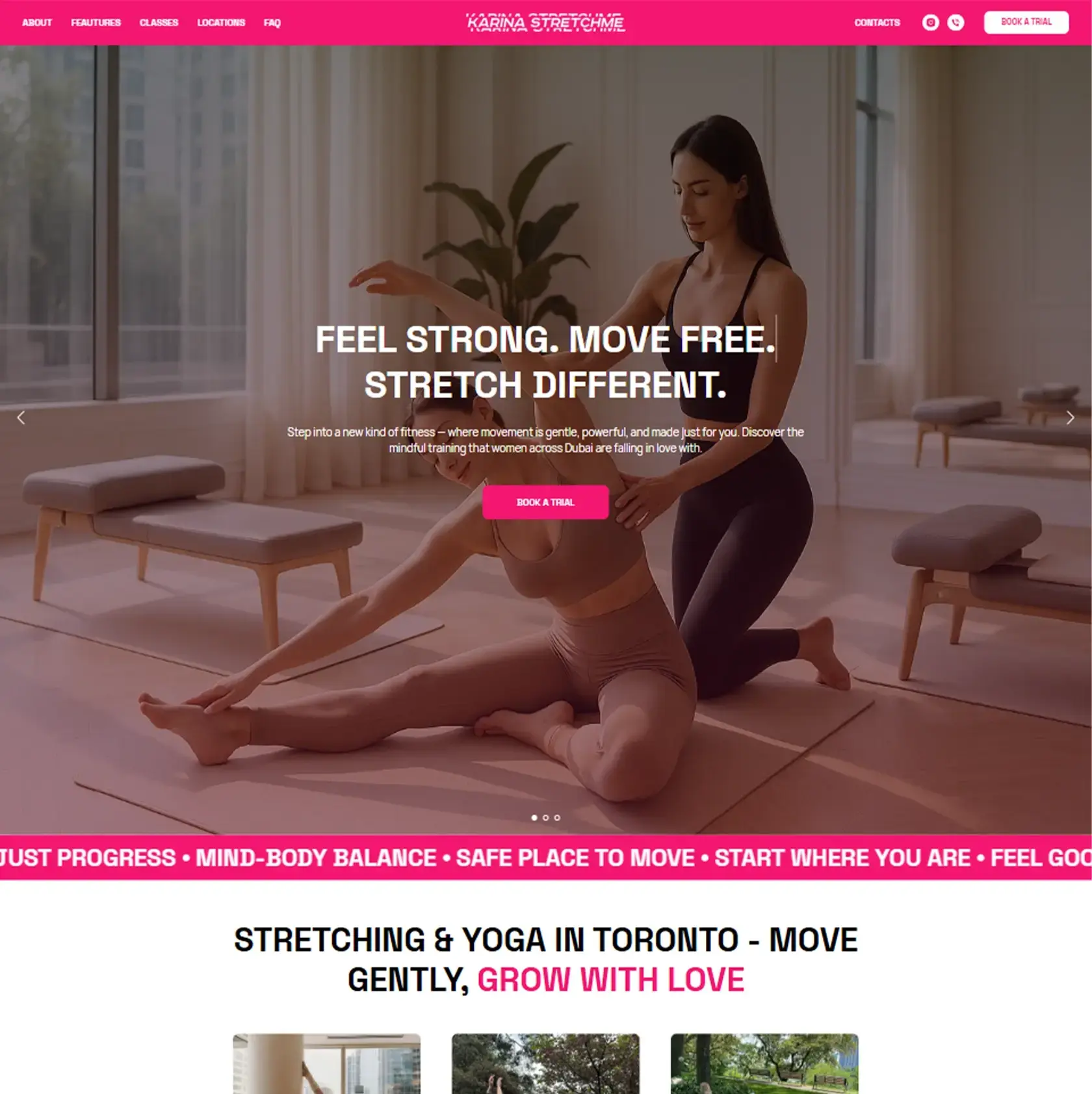
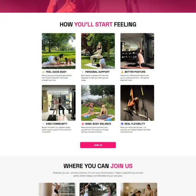
Karinastretchme.ca first screen - stretching studio website in Toronto by Thrive Solutions
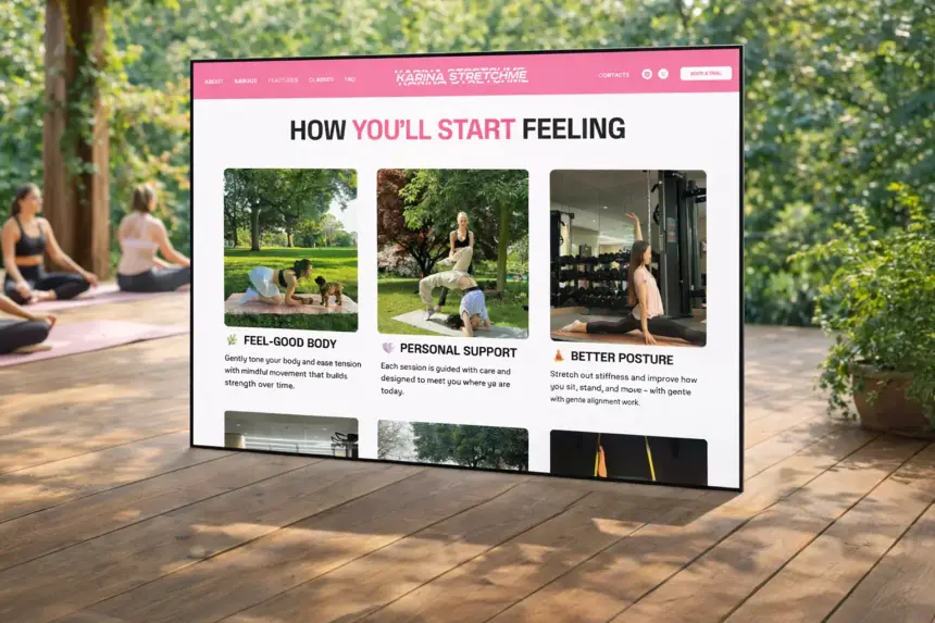
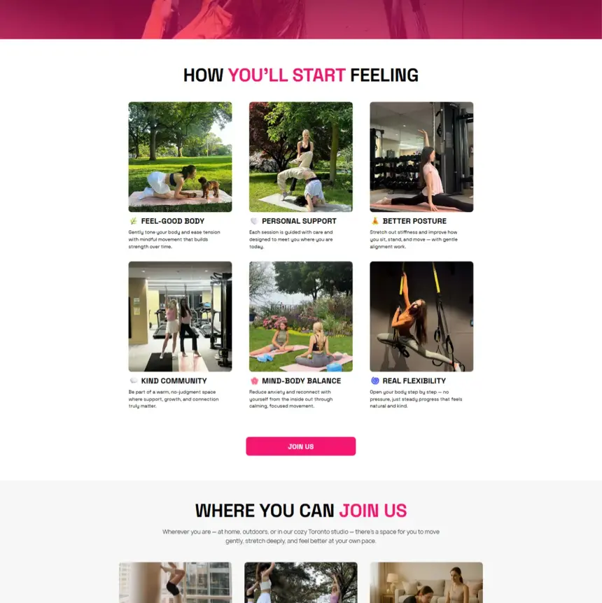
Class booking section on Karinastretchme.ca
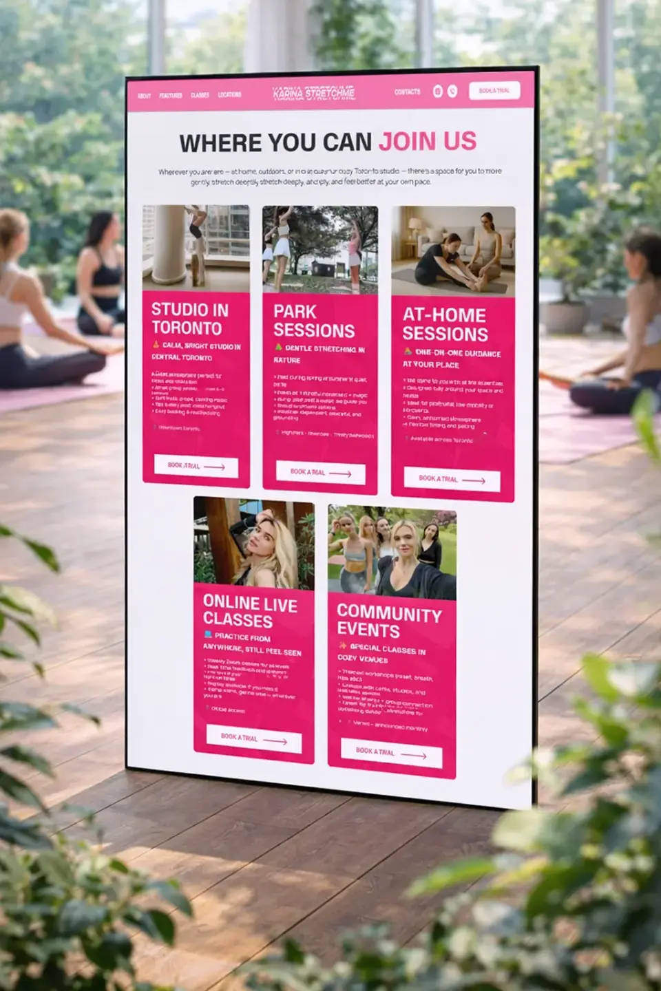
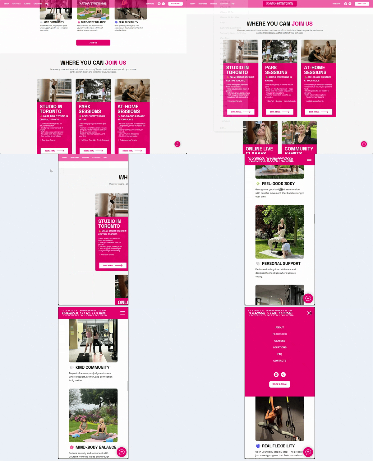
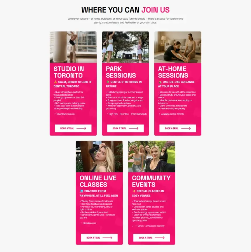
Class formats on the Karina Stretch Me website
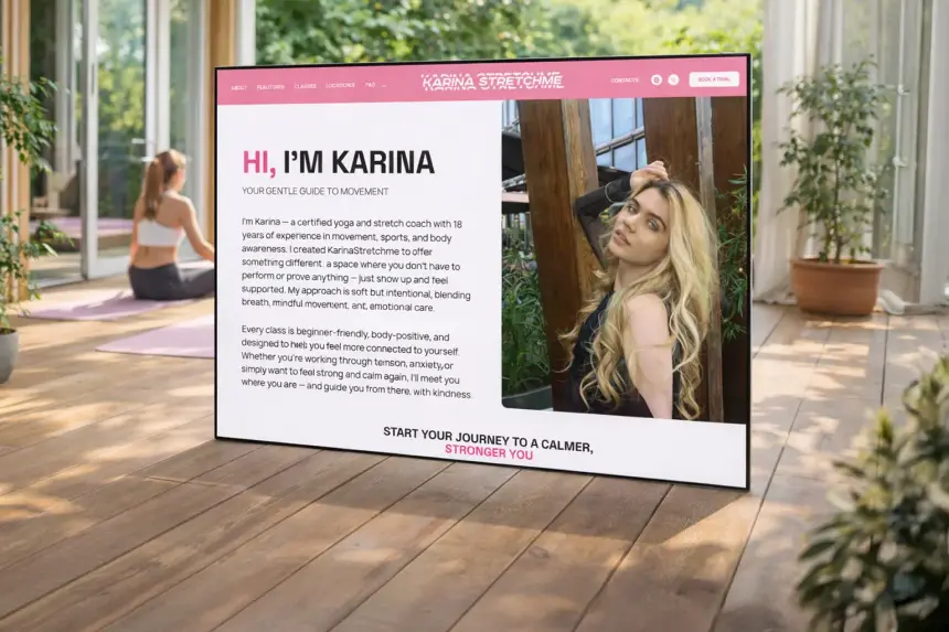
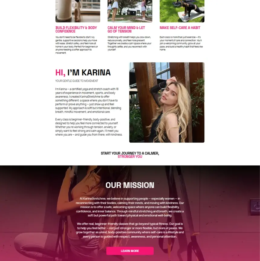
Coach's story on the Karina Stretch Me website
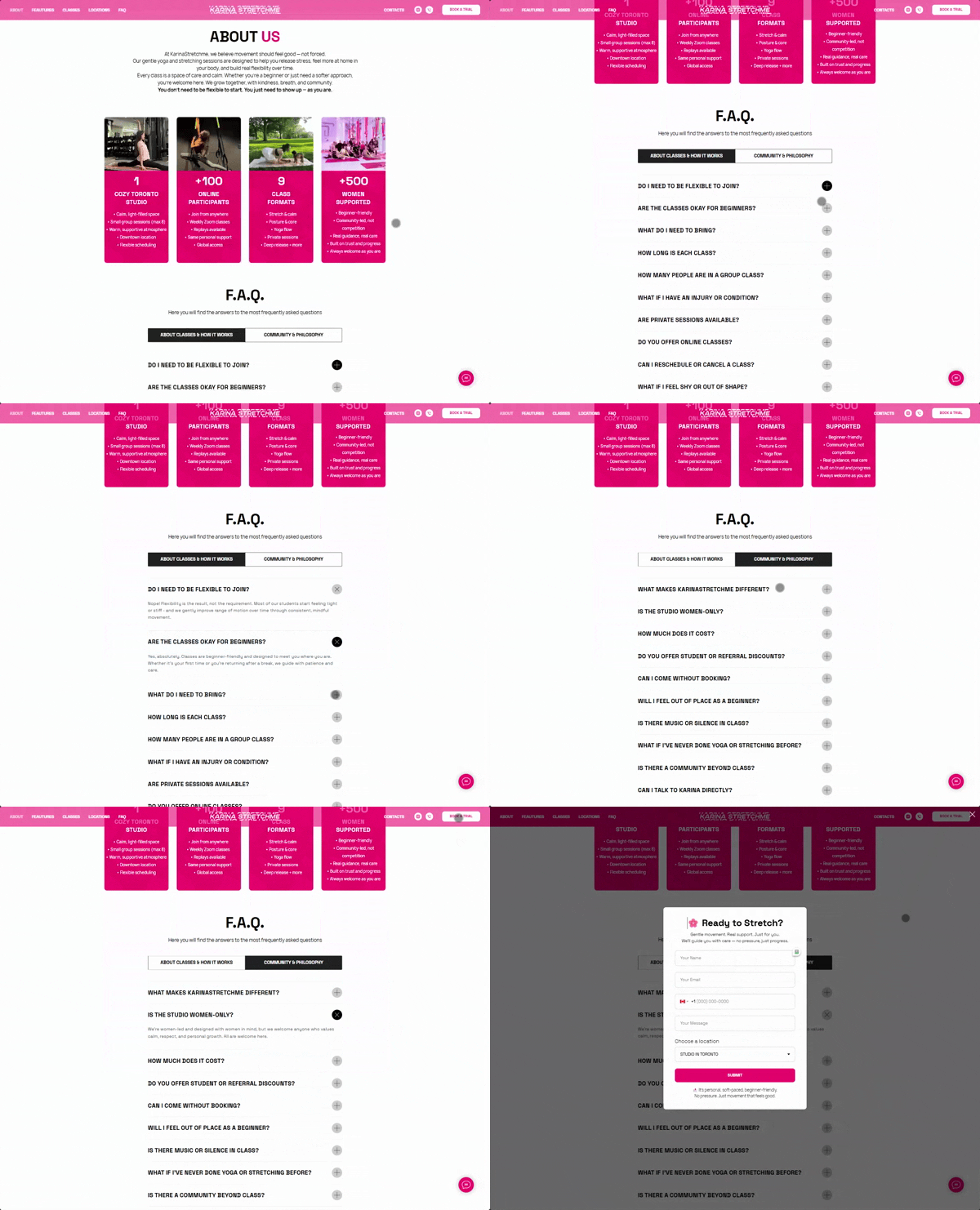
Trial class booking on Karinastretchme.ca
01

Make booking a first class feel easy and safe

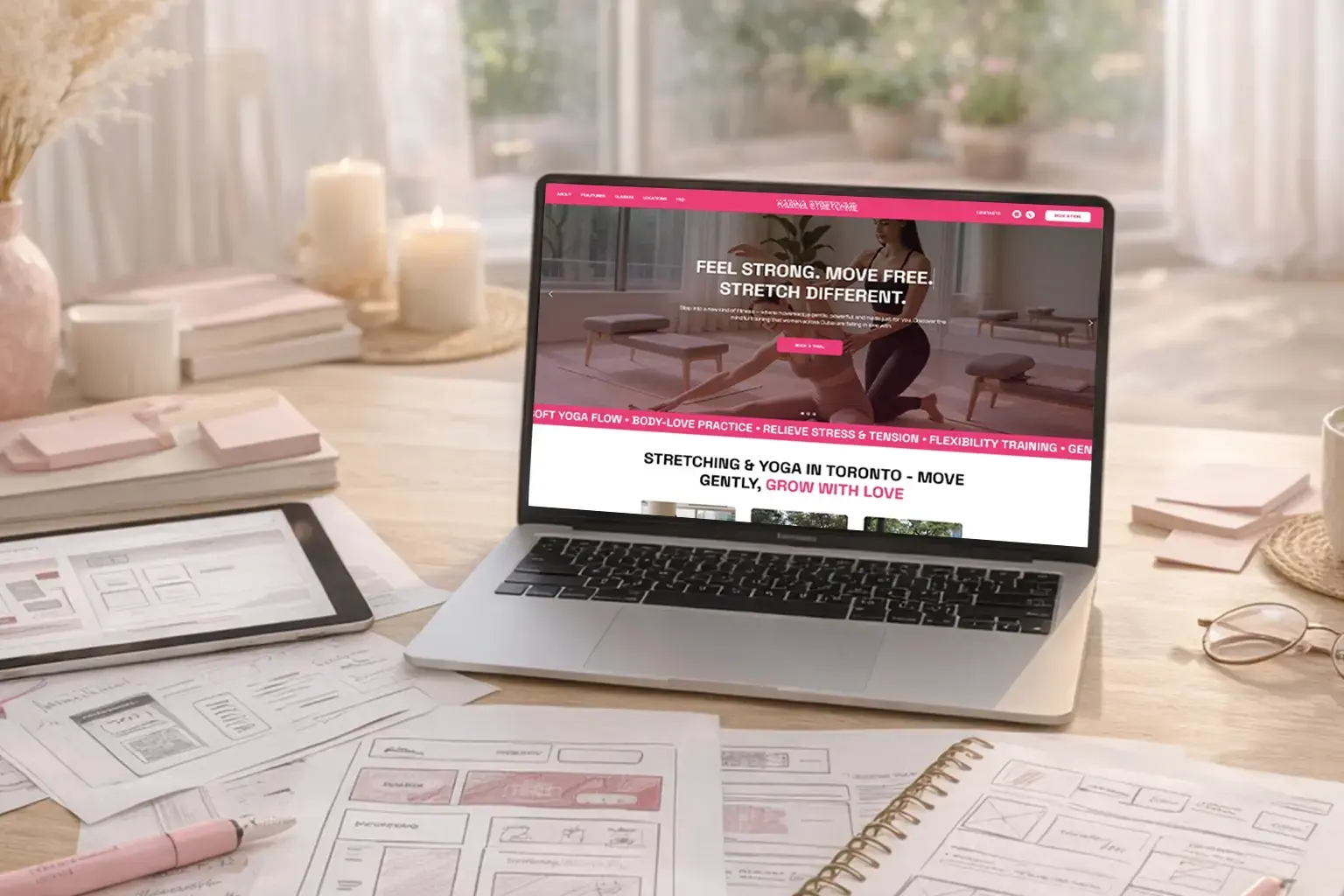
Karina Stretch Me website on a laptop in a studio

Women choosing a studio want to feel welcome before they walk in. The site had to present the class formats clearly and make booking a trial class the obvious next step.

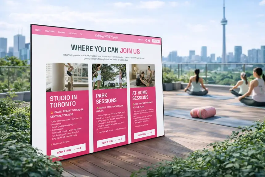
We organised in-studio, outdoor, at-home and online classes, shortened the path from interest to booking and conveyed an atmosphere of support, softness and safety - with the coach's personal brand at the centre.

  • Clear class formats
  • A short path to a trial class
  • Atmosphere of support
  • A strong personal brand
02

Formats, levels and how women decide

We analysed class formats and booking scenarios - in-studio in Toronto and online - to show directions and levels on the first screens and make choosing easy.

Karina Stretch Me website on a tablet in a bright room
Class specifics

Levels, formats, class length and the audience's needs.

Purpose of the site

A structure that leads quickly to choosing a format and booking a trial.

Audience behaviour

From first acquaintance to booking without extra steps.

Positioning

A space that feels right for beginners and experienced members.

03 · User journey

A gentle path from first feeling to booking

Each block helps visitors understand the formats, feel the atmosphere and decide - without pressure.

Karina Stretch Me home page on a laptop
Step 1

Meet the studio

  • Focus from the first screenThe brand message and a clear booking call show the value right away.
  • Navigation by formatClasses are split by how and where they happen.
  • Always a way to bookBooking buttons repeat down the page, keeping context.
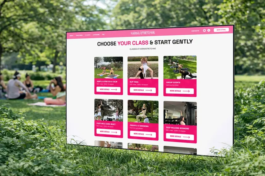
Class formats of Karina Stretch Me on a laptop
Step 2

Choose a class

  • By way of joiningIn the studio, outdoors, at home or online.
  • Clear class cardsA short description, level and a booking button.
  • A quick decisionAtmosphere and benefits help pick the right option.
Booking form of Karina Stretch Me on a laptop
Step 3

Book a trial

  • Natural progressFrom the coach's story to choosing a class.
  • Trust blocksMission, approach and FAQ remove doubts before booking.
  • A simple formBooking is quick and clear.
04 · Visual system

Soft, warm and full of movement

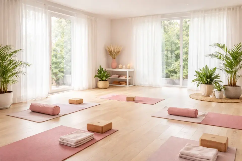
The design is built on gentle movement, natural light and support - feminine and calm, with nothing to distract from choosing a class.

  1. 01

    Clear directions

    Classes split by format help find the right fit for any level and lifestyle.

  2. 02

    A warm palette

    Warm and bright brand accents create energy and a sense of community.

  3. 03

    Movement in focus

    Large photos of real classes convey the atmosphere at a glance.

  4. 04

    A light interface

    Few distractions keep attention on classes and booking.

  5. 05

    Easy comparison

    Page and card structure make comparing formats simple.

  6. 06

    Comfortable anywhere

    Booking works as well on a phone as on a desktop.

05

An interface built around real visitors

Getting to know the philosophy, choosing a format and booking a class - the focus is on emotional connection and a predictable path to booking.

Atmosphere from the first screen

Visuals, a manifesto and a clear call to book show the brand's values.

Trust through a personal story

The coach's story builds an emotional connection and safety.

Booking always nearby

Booking buttons accompany the visitor at every step.

Karina Stretch Me mobile site on a phone
Karina Stretch Me website on a laptop
Karina Stretch Me class page on a monitor
06 · Interaction

A booking flow that feels effortless

The site responds to visitors' choices, simplifies picking a format and makes booking quick and predictable.

Animated class formats on Karinastretchme.ca
Fast choiceClear directions and cards help find the right format.
Animated class cards on the studio website
Interactive cardsClass cards and descriptions show atmosphere and benefits.
Animated mobile version of Karina Stretch Me
Easy on phonesJust as simple to choose and book on a smartphone.
07 · Result

A website that brings women to their first class

Karinastretchme.ca brings together class formats, online booking and communication with the community. It simplifies choosing a class, builds trust in the brand and supports the studio's growth.

For the brand

More recognition, stronger positioning and a steady flow of class bookings.

For visitors

Clear formats, honest descriptions and a quick path to booking.

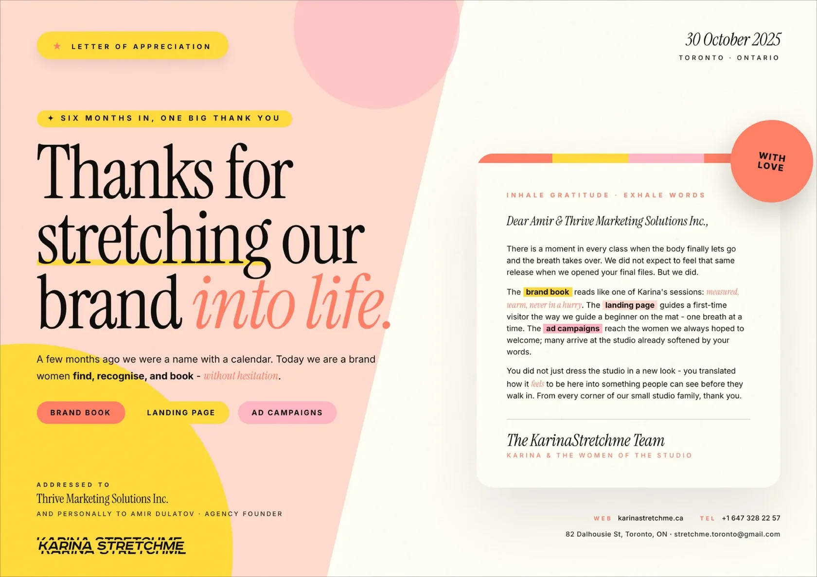
Letter of recommendation from Karina Stretch Me to Thrive SolutionsClient letterKarina Stretch Me recommends Thrive SolutionsRead the letter
Full home page of Karinastretchme.ca, stretching studio website in TorontoHover to scroll the page
Let's talk

Ready to be the business Toronto finds first?

Tell us about your project and get a free growth plan within one business day: what to fix, what to build and what it will cost.