

UX, short for user experience, has a reputation for being about beautiful interfaces. On a business website it is far more practical than that. It is about removing every small reason a visitor has to hesitate, get confused or give up.
These are the details we look at first when a site gets traffic but not enough enquiries. None of them requires a full redesign, and several take less than an hour to fix.
Contents7 sections
The first screen does most of the work
On a phone, the first screen is roughly what fits above your thumb. In that space a visitor needs to learn what you do, whether it is for them and what to do next. A headline that names the service and the area, one line of promise, a button and a sign of proof such as a review score will do more than any animation.
Sliders are the most common casualty of this rule. Few people wait for the second slide, so everything important ends up hidden behind the first.
Every extra decision costs you
Each choice on a page adds a little friction. Three different buttons that all lead somewhere slightly different, a menu with fourteen items, pop-ups asking for a newsletter before the page has even loaded. The visitor has to think, and thinking is where people drop off.
Give each page one primary action and repeat it. Keep button wording consistent across the site. Use the plainest possible labels, even if they sound less clever.
Forms people actually finish
- Ask only for what you need to start the conversation: name, phone or email, and a short description.
- Put labels above fields, not inside them where they vanish when someone starts typing.
- Use the right keyboard on mobile, such as the number pad for phone fields.
- Show errors next to the field, in plain words, while the person is typing.
- Confirm clearly that the message was sent, and say when you will reply.
Offer a phone number next to every form as well. Some people would rather talk, and for urgent services most of them would.
Designing for thumbs
Buttons and links should be comfortably tappable, around 44 pixels high at a minimum. Body text should be at least 16 pixels so nobody has to pinch to zoom. Anything that only works on hover, such as menus that open when a mouse passes over them, needs a tap-friendly alternative.
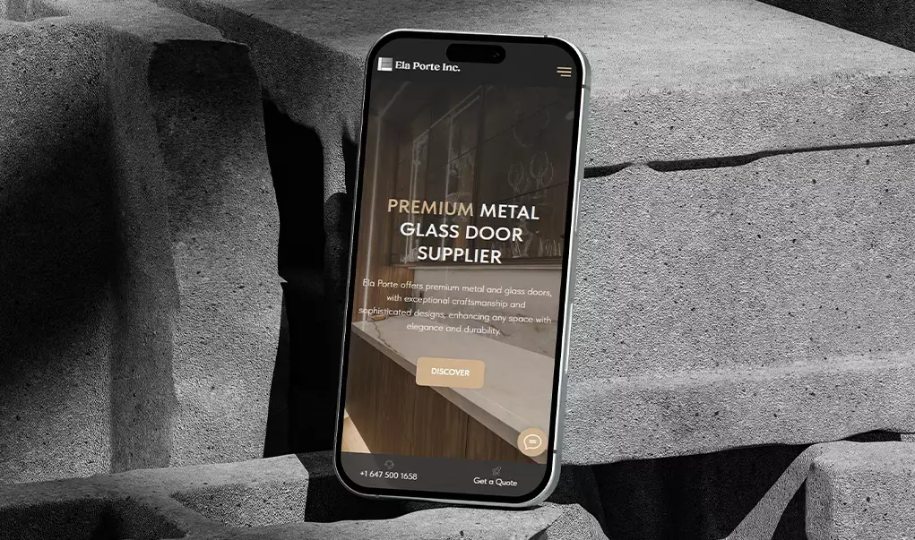
A sticky bar at the bottom of the screen with Call and Get a quote is one of the most reliable improvements we make on mobile. Test all of this on a real phone, not only in a desktop browser shrunk to phone size.
Reassurance at the moment of doubt
People hesitate at predictable moments: just before they fill in a form, just before they call, just after they see a price. That is where reassurance belongs. A line under the form that says “We reply within 15 minutes during business hours”, a review from a nearby customer beside the button, a note that the estimate is free and without obligation.
Put the reassurance where the doubt happens, right next to the button.
Accessible is usually more usable
Good contrast, visible focus states, proper form labels and meaningful link text help people using screen readers, and they also help everyone reading on a phone in bright sunlight. For Ontario organizations with 50 or more employees, meeting WCAG 2.0 AA is also an AODA requirement.
Watch five people use your site
You do not need a lab. Ask five people who match your customers to find a service and request a quote on your site while you watch quietly. Free session recording tools such as Microsoft Clarity show the same thing at scale. Patterns appear quickly: the button nobody sees, the field everyone hesitates over.
Fix what you see, then measure enquiries before and after. When traffic allows, test changes against each other. That loop is the heart of our conversion optimization and UX/UI design work.