+1 (437) 826-8716Book a free call
Case study · Landscape design · Corporate website

GreenFuture: a landscape design website where the projects do the talking

GreenFuture designs and builds private gardens and public spaces, where details and atmosphere win the client. We built a corporate site that shows the level of their work and turns visuals into a sales and image tool.

Client
GreenFuture
Location
Almaty, Kazakhstan
Industry
Landscape design & landscaping
Scope
Strategy, UX/UI design, website development
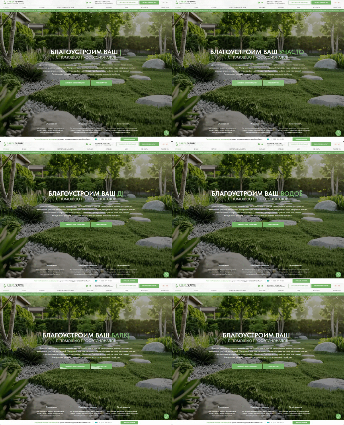
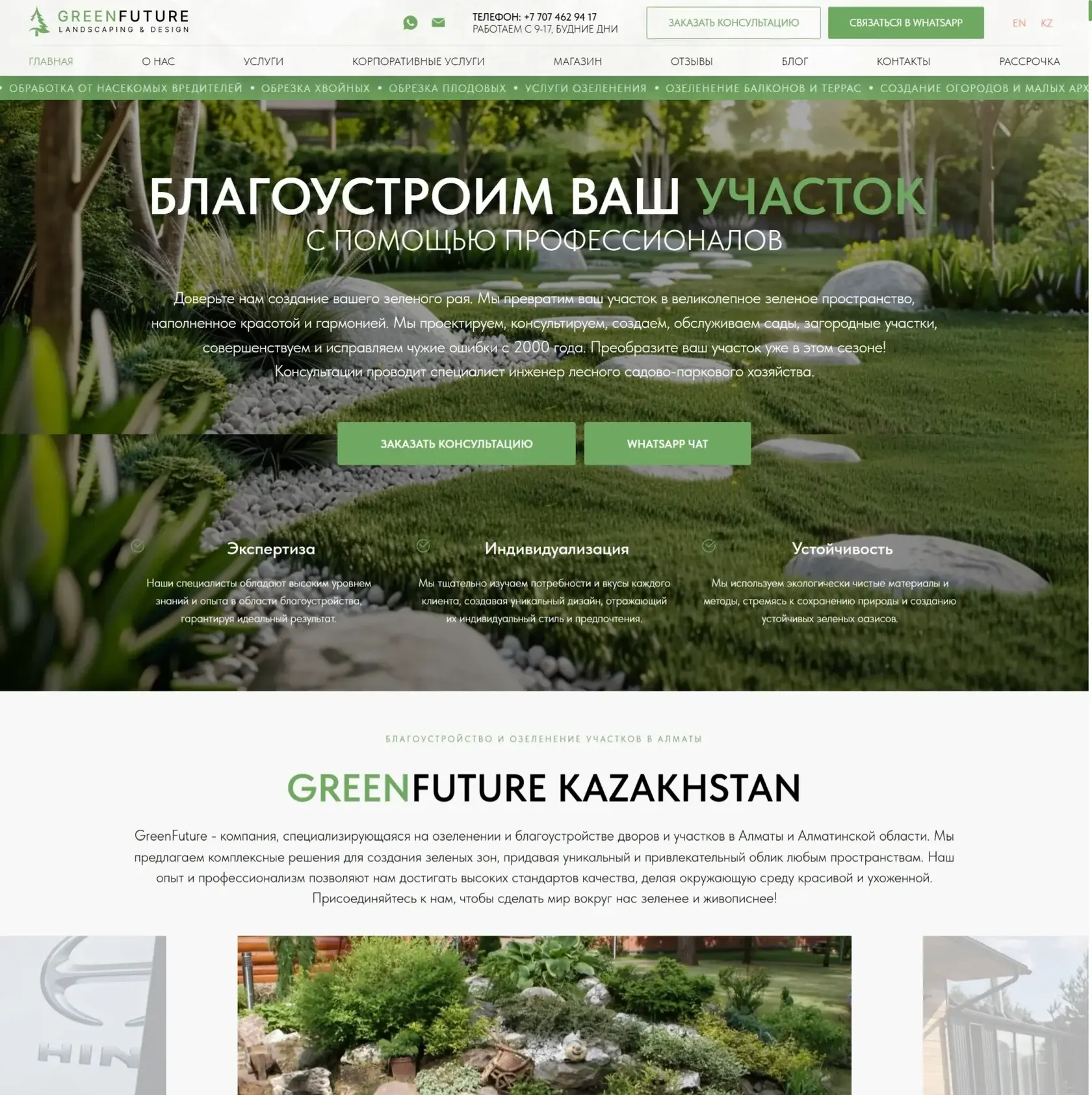
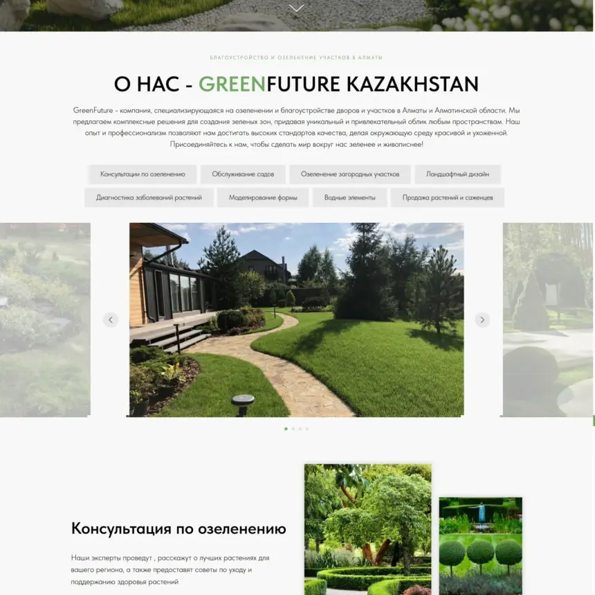
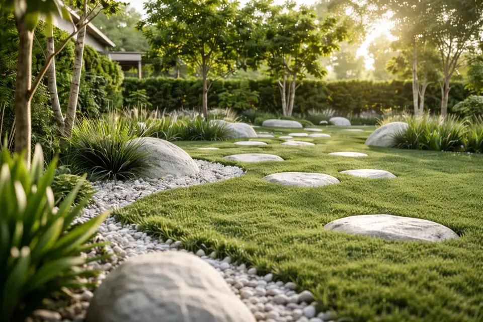
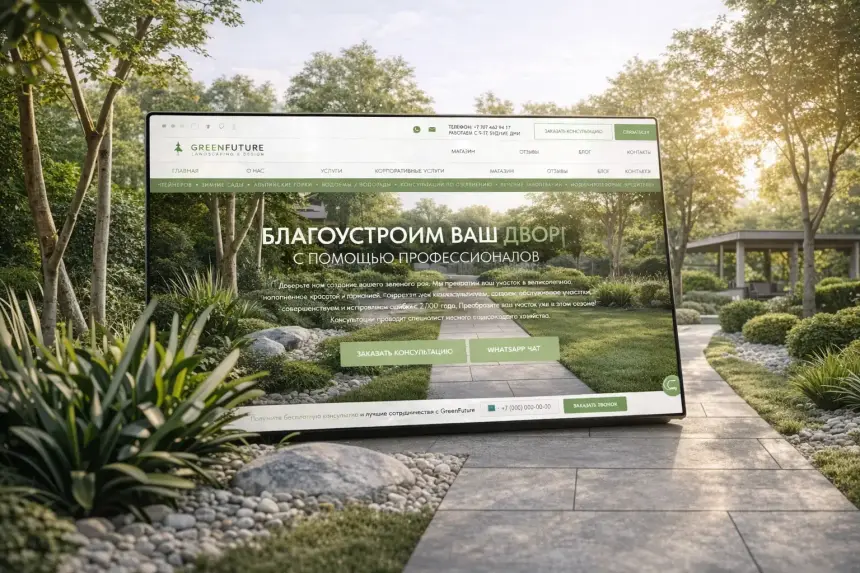
GreenFuture website first screen with a landscaped garden - designed by Thrive Solutions
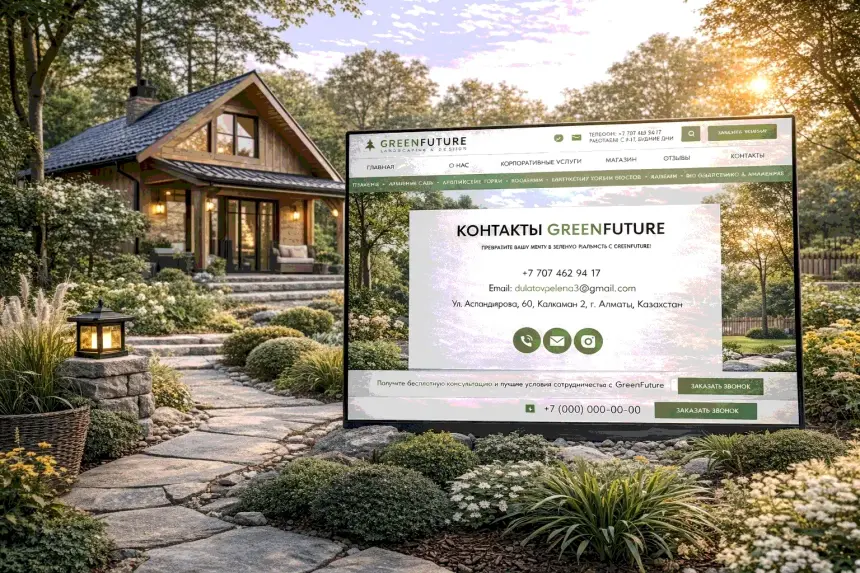
GreenFuture contact and request section
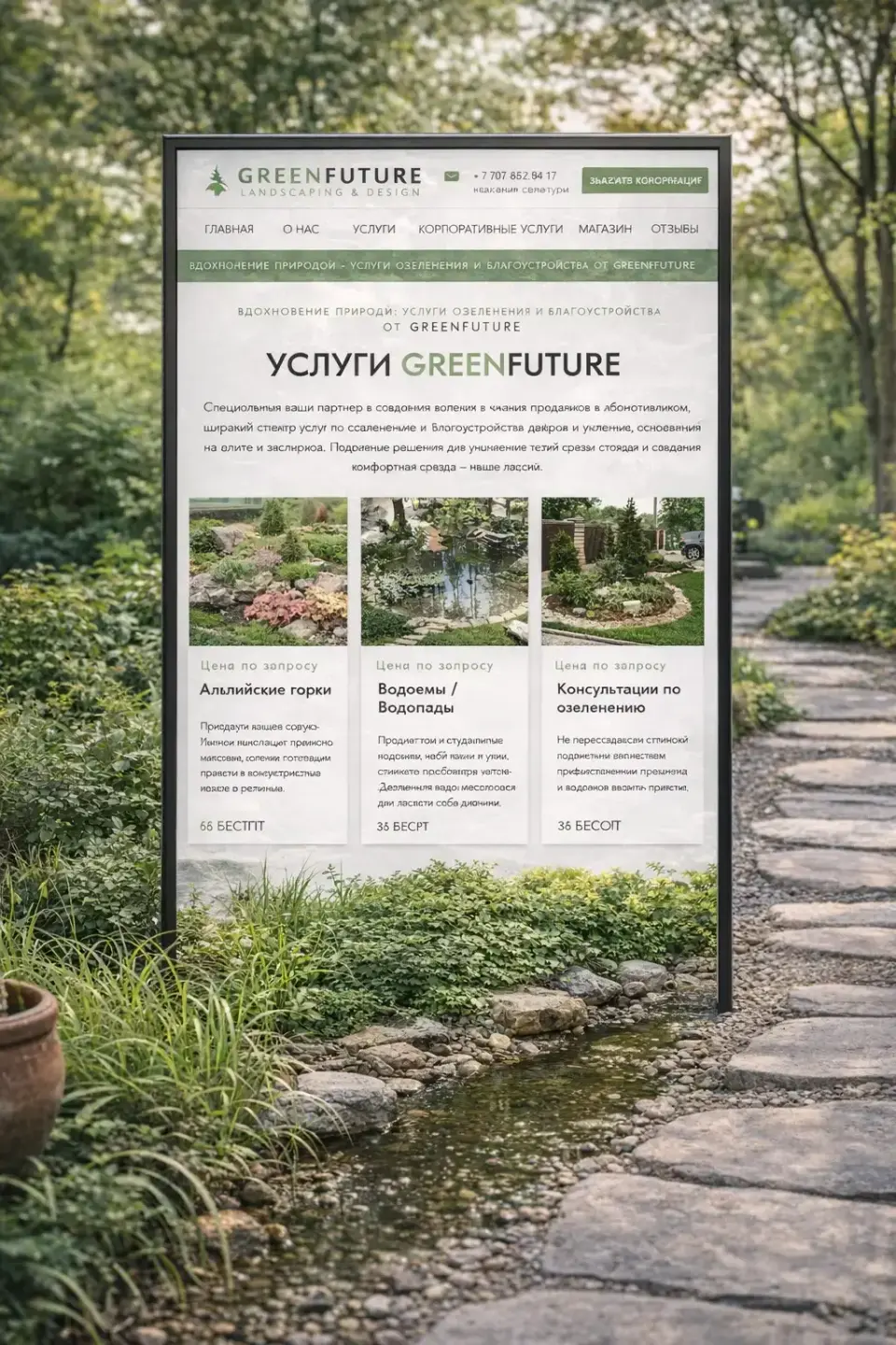
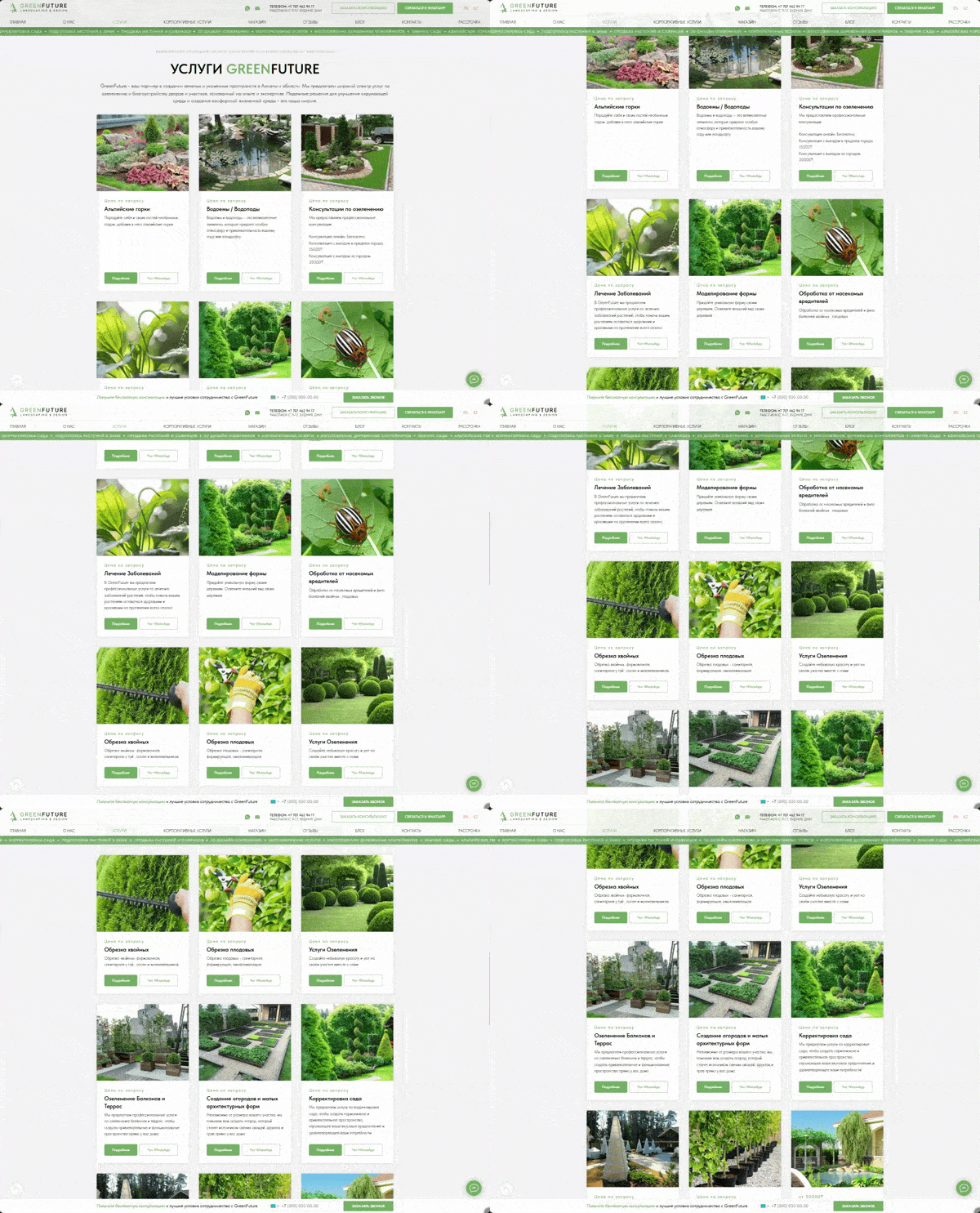
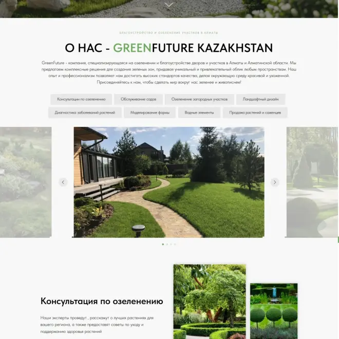
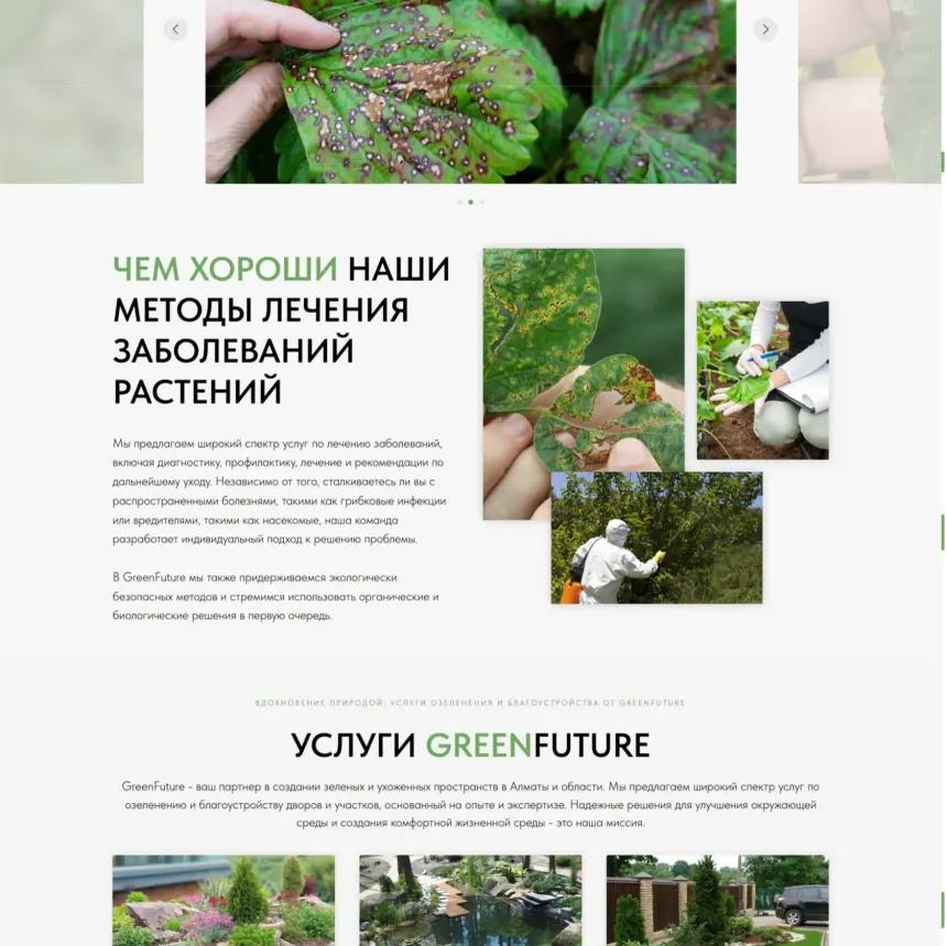
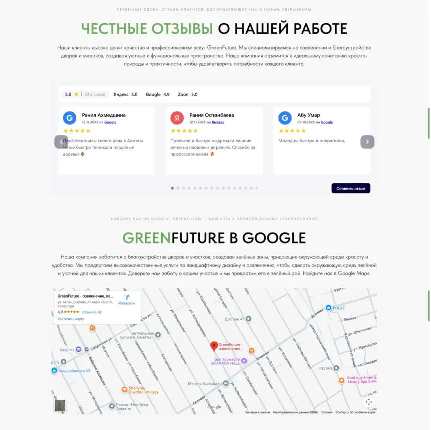
GreenFuture services section
GreenFuture landscape project portfolio
GreenFuture website request form
01

A site that feels like the gardens they build

GreenFuture landscape design website on a laptop

In landscape design, clients buy an atmosphere they can't touch yet. The website had to reflect the company's level, approach and character from the first seconds.

The key task was to highlight the quality of completed projects, convey the brand's philosophy and build steady trust - so the visuals and structure create the right impression and work as one brand image.

  • Show the level of projects
  • Convey the brand philosophy
  • Build trust in the first seconds
  • Turn visuals into requests
02

Understanding the business and its clients

We studied the market and GreenFuture's audience to decide what should sell, what should build trust and how the brand should stand apart.

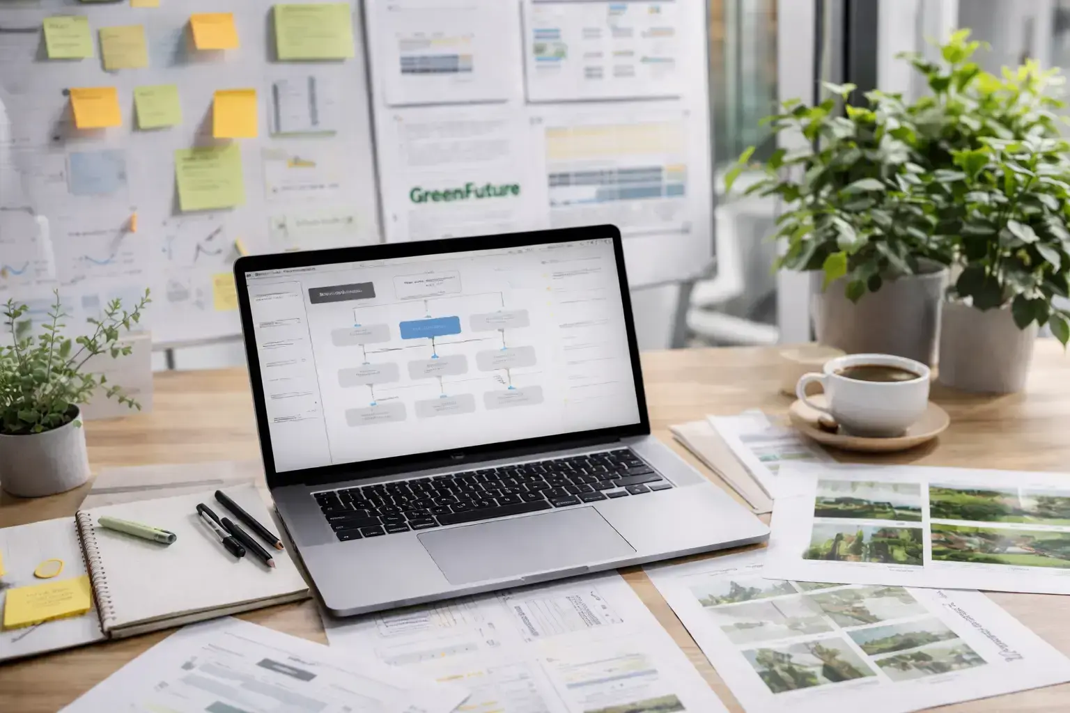
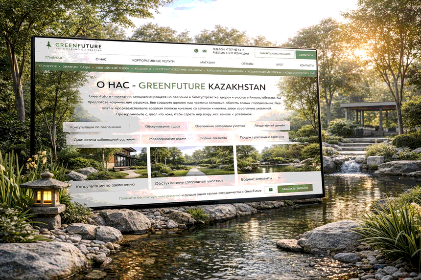
GreenFuture website on a laptop surrounded by greenery
Niche context

Where visual and messaging differences can stand out in a crowded market.

Project focus

Which pages earn money and where trust needs reinforcing.

Audience expectations

Which screens sell and which reassure.

Brand image

A calm, confident brand that appeals to private and public clients.

03 · User journey

From first impression to a request

Each screen builds trust, explains the services and gently leads to a decision - no pressure.

GreenFuture home page on a laptop
Step 1

First impression

  • The right moodThe site sets the atmosphere and visual level in the first seconds.
  • Clear positioningVisitors immediately understand what GreenFuture does.
  • Scale of projectsLarge visuals show the level of completed work.
GreenFuture portfolio page on a tablet
Step 2

Building trust

  • ExpertisePortfolio and details prove the team's experience.
  • Quality in detailsAccents, rhythm and presentation feel carefully made.
  • TransparencyStructure and visuals remove doubts about the brand.
GreenFuture request form on a laptop
Step 3

The request

  • A logical routeVisitors move through the site without extra steps.
  • Clear signpostsKey blocks and wording guide to the target action.
  • A comfortable decisionThe site leads to contact gently, without pushy calls.
04 · Visual system

Space, light and natural calm

We avoided anything overloaded so the visuals would highlight GreenFuture's projects and a sense of quality.

  1. 01

    Space and air

    Generous whitespace keeps focus on the visuals and creates balance.

  2. 02

    A natural palette

    Colours come from nature and support a feeling of harmony.

  3. 03

    Visuals lead

    Large images and few distractions let projects speak.

  4. 04

    Minimal details

    No unnecessary decoration keeps the interface clean and premium.

  5. 05

    Rhythm and composition

    A clear grid makes pages light and easy to navigate.

  6. 06

    Adaptive aesthetics

    Every visual decision works on large screens and phones.

05

The design in real screens

Space, light and a measured rhythm of blocks create a coherent brand image that underlines the level of every project.

Context

Nature becomes part of the story and strengthens the brand's link with harmony.

Details

Close-ups, light and textures show care and craftsmanship.

Space

Free composition and large images create calm and balance.

GreenFuture website on a vertical screen in a garden setting
GreenFuture project page on a laptop
GreenFuture services page displayed outdoors
06 · Interaction

Living, responsive interactions

Dynamic elements make navigation easy and working with content intuitive and pleasant.

Animated navigation on the GreenFuture website
Clear navigationStructure and interactive elements help visitors find their way.
Animated sections of the GreenFuture website
Living elementsSmooth transitions make the site feel alive.
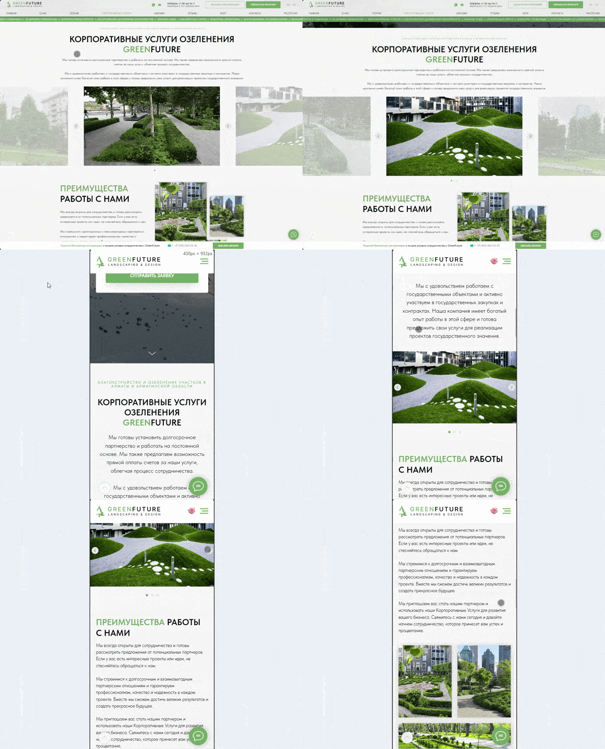
Animated mobile view of the GreenFuture website
AdaptiveEverything keeps its look on every device.
07 · Result

A website as calm and confident as the brand

The new site reflects GreenFuture's philosophy, demonstrates the level of its projects and builds trust from the first seconds - turning visitors into project requests.

For the brand

A stronger premium image and a clear position in the landscape design market.

For clients

Real projects, clear services and a gentle, simple way to get in touch.

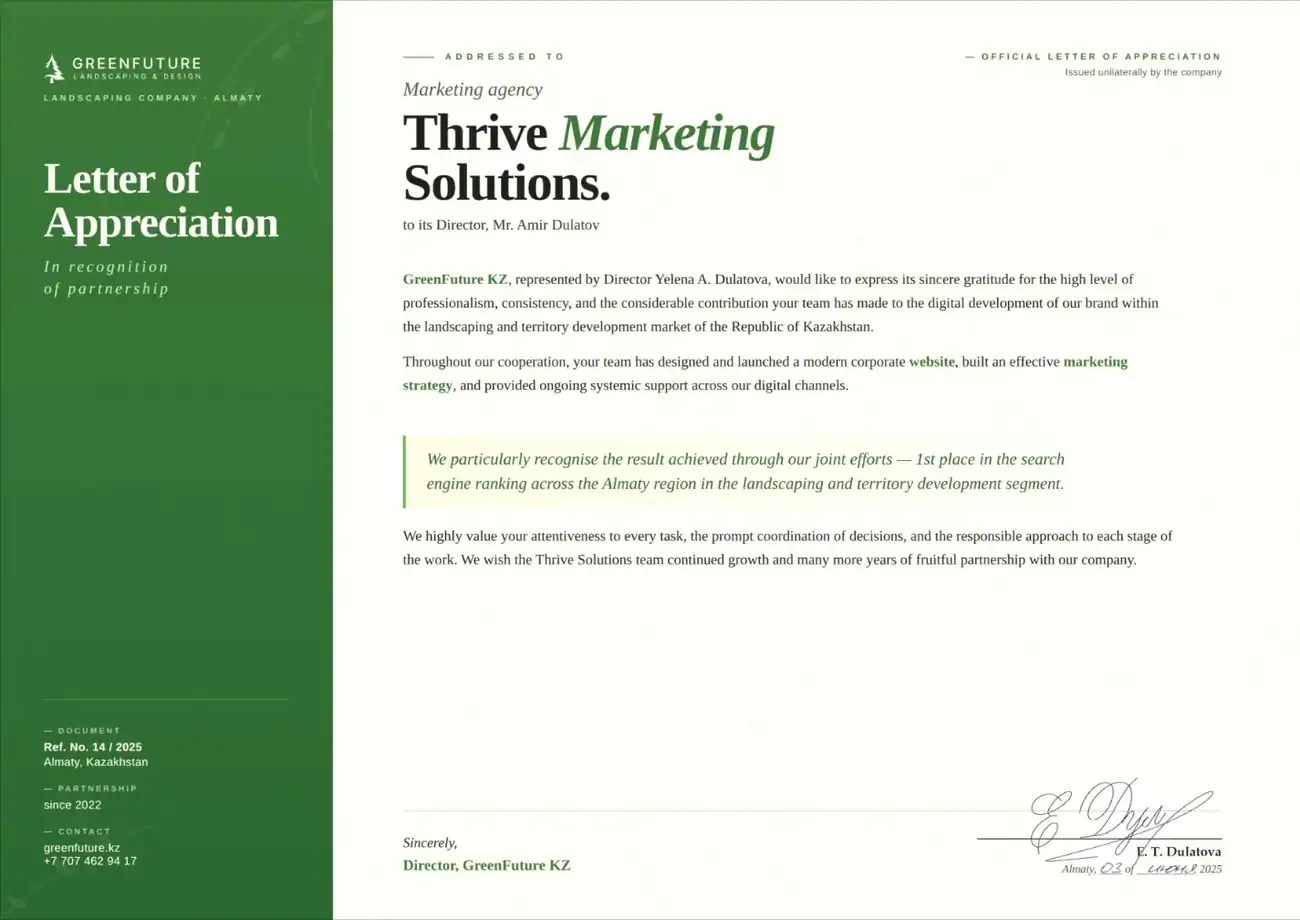
Letter of recommendation from GreenFuture to Thrive SolutionsClient letterGreenFuture recommends Thrive SolutionsRead the letter
GreenFuture home page screenshot
GreenFuture projects page screenshot
Let's talk

Ready to be the business Toronto finds first?

Tell us about your project and get a free growth plan within one business day: what to fix, what to build and what it will cost.